As of writing this, we have decided to extend the lease in our current apartment, but that doesn’t mean that I’m not totally enamored with these stunning homes. While I enjoy making things colorful, I prefer a very minimal space at home. I like neutrals with small pops of color, white walls, and open spaces. Even though we won’t be moving into a new home for quite some time, I’m still all about looking for more minimal apartment inspiration so that I’ll be totally prepared when the day does come. Here are a few of my favorites right now.
Minimal Apartment Inspiration
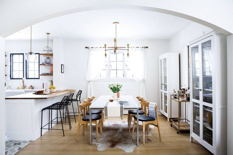 Image courtesy of Domino
Kate Arends’ home feature in Domino is simply stunning. It’s minimal with neutral colors, carefully selected pieces, and contains a bit of a surprise! If you click through the feature, you’ll see that one small powder room is outfitted in one of the most fun, bright patterns. My favorite here is how open the spaces is – I adore being able to cook in an open space and despise being closed in when in the kitchen. Always a plus for entertaining!
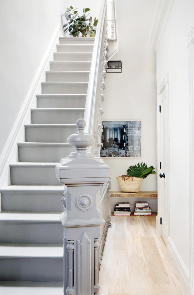 Image courtesy of Lark & Linen
I’m not sure what it is, but this home seriously caught my eye when Jacquelyn of Lark & Linen shared it on her blog. I love how minimal this stairwell and hallway are. It’s decorated, but not overwhelmingly so. It also seems fairly spacious, especially when you realize this is an apartment in Brooklyn!
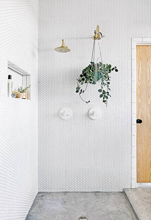 Image courtesy of Domino
Before I even go any further, how unreal is this bathroom tiling?! Alyson Fox’s home is absolutely incredible, and to be frank, a minimalist’s dream. It’s so simple, boasts incredibly open spaces, and it’s not cluttered by any means with unnecessary items. Now…only a few more days weeks of purging my belongings to get there. If you’re looking for some seriously minimal apartment inspiration, this is where it’s at.
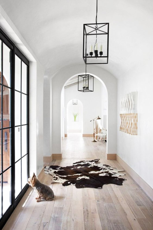 Image courtesy of SF Girl By Bay
I spotted this entryway in a feature on SF Girl By Bay and couldn’t get over it. It was included in her post ‘making a grand entrance’ and I was immediately in love. Sure, it is a grand entrance, but it’s also quite minimal as well. It’s got light neutrals and a few accent pieces. That rug isn’t normally my style, but I think it so works here. And don’t get me started on those windows.
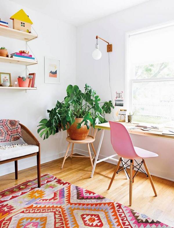 Image courtesy of Domino
I think the word ‘minimal’ can be arbitrary. For me, it means a clean, open space with a few of my favorite things rather than items cluttered about. What minimal doesn’t mean for me is boring, or bland, or plain. I think you can decorate a home minimally, but include color as you please. Example A: Claire Zinnecker’s Austin workspace. I fell in love with this room when I saw it in her feature on Domino. It’s bright, colorful, and still quite minimal (for my preferences).
So what’s your take? Are you diggin’ this minimal apartment inspiration or do you prefer homes that look a bit more ‘lived-in’ or filled up?
g.
I am so into neutrals (especially white) and open spaces, too! Some serious inspo for when it comes time to decorate my home! Love these designs!
xx, Danielle | Pineapple & Prosecco
Yay! I’m glad you enjoy the photos as much as I did! Neutrals is where it’s at 😉
g.